Fourteen web hosting website design examples appear below. Each one was chosen for a single reason: it demonstrates a specific, nameable pattern that explains why it converts. A hosting homepage sells trust before it sells a plan, and the strongest examples prove it.
Below are the five criteria that separate an effective hosting homepage from a generic one. Fourteen annotated examples follow, grouped across four hosting categories: shared and budget, managed WordPress, cloud and VPS, and domain and reseller hosting. A closing section turns the pattern into three directives for your own design.
What Makes a Good Web Hosting Website Design?
A good web hosting website design makes five things clear fast: price, trust, domain search speed, audience fit, and a design that looks reliable. The strongest homepages address at least three of these five at once. The visual register matters too. A clean, bright layout suits a mass-market host, while a darker, technical look signals a cloud or developer product.
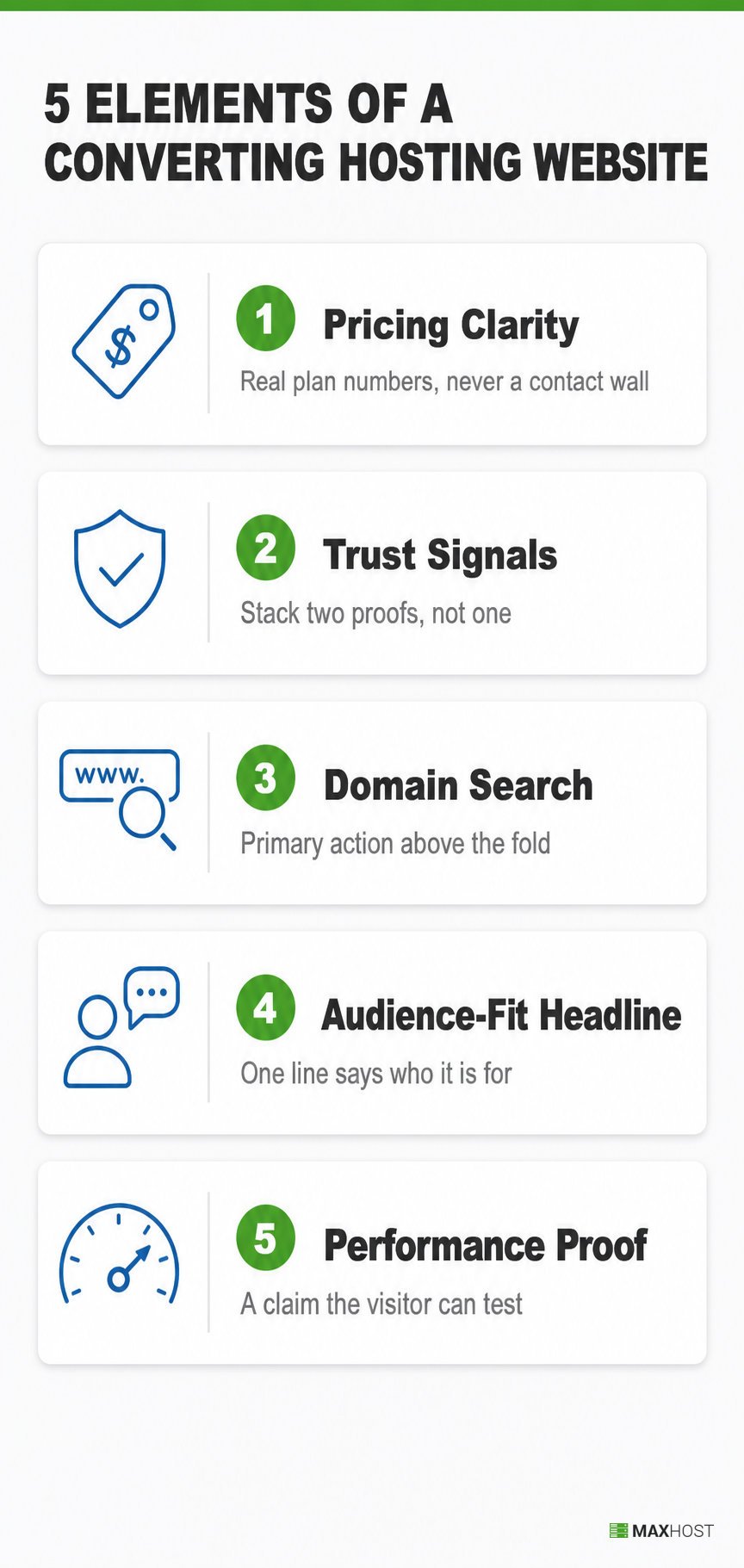
- Pricing clarity. The homepage shows a plan-comparison table or a card grid with real numbers. It never hides pricing behind a contact-us wall. The strongest pages also make the renewal rate visible, not just the introductory sticker price. Hostinger's three pricing cards sit directly under its hero, each paired with a discount percentage. Building this kind of pricing table in WordPress takes a plugin, not custom code, as this guide covers.
- Trust and reliability signals. The page stacks more than one proof type: an uptime figure, a review-platform badge, a customer count, or a named logo. One claim alone reads as marketing; two corroborate each other. Placing that proof next to the pricing table or signup button, not buried lower, is where it converts hardest. hosting.com pairs a 4.7 Trustpilot score with a completed-migration count on the same screen.
- Domain search or primary-action prominence. The domain search box, or the site's equivalent primary action, sits among the first interactive elements. A visitor can start the core action before scrolling past the hero. Namecheap opens on a register-or-transfer widget rather than a paragraph of copy.
- Audience-fit positioning in the headline. The hero headline tells the visitor who the site is for, not only what it does. A stranger reading only the headline could guess the target buyer. HostGator's "Build it. Grow it. Show it off." speaks directly to a small-business owner.
- A visual performance signal. The page's own design implicitly backs up its speed or reliability promise, through a diagram, a live test, or evidence the visitor can interact with. A bare claim is weaker than proof. Vultr lets a visitor test latency to a specific data center themselves.
| Element | Why it converts | Example |
|---|---|---|
| Visible pricing table | Removes the "how much will this cost" hesitation before it forms | Hostinger's three-tier cards |
| Two or more stacked trust signals | Different proof types corroborate each other faster than one large claim alone | hosting.com's Trustpilot score plus migration count |
| Domain search near the top | Lets the visitor start the core action before reading any copy | Namecheap's register-transfer widget |
| Audience-fit headline | Tells the visitor in one line whether the site is built for them | HostGator's "Build it. Grow it. Show it off." |
| A provable performance signal | Turns a speed claim into something the visitor can test themselves | Vultr's per-region test speed links |
The fourteen examples below were chosen because each one demonstrates at least one of these five patterns clearly.
Shared and Budget Hosting Website Design Examples
Shared and budget hosting sells to a mass-market buyer who compares on price first. The four examples below lean hardest on pricing clarity and trust stacking, since a budget buyer wants the numbers and the proof before anything else.
Hostinger, stacking discount math next to the sticker price
Hostinger's hero leads with three pricing cards directly below the headline, each showing a discount percentage next to the monthly rate. The cards read 75%, 80%, and 71% off, so the visitor sees the math already done. This removes a calculation the visitor would otherwise run themselves, whether the deal is genuinely good.
The principle transfers beyond hosting: a discount percentage next to a low price turns comparison into a glance, not a spreadsheet. One gap: the hero itself is a looping video, which works against a brand whose entire pitch is speed.
HostGator, an audience-fit headline that speaks in the buyer's own verbs
HostGator's headline reads "Build it. Grow it. Show it off," paired with a subhead promising a site, a store, email, and support in one package. The verbs describe what a small-business owner actually does, not what the product technically offers. A "Recommended" badge on the Baby plan removes a second decision: which tier to pick.
The domain search section, titled "Domain Hunting Made Easy," sits mid-page as its own block, separated from the pricing table above it. One gap: pricing and domain search never appear in the same glance, so a visitor comparing cost and domain availability has to scroll twice.
hosting.com, three proof types on one screen
hosting.com opens on "The hosting platform you won't outgrow." A 4.7 Trustpilot score across 6,352 reviews sits directly below it. So does a count of 100,000 completed migrations and a sub-one-minute average chat response time. Three proof types sit together: a review aggregate, a completed-task count, and a support-speed metric. Together they answer three separate doubts at once: is it good, do switches work, and will support respond.
One gap: nothing on the homepage acknowledges the site's former name, A2 Hosting. A returning customer searching for the old brand finds no bridge between the two identities.
SiteGround, proof-led design in place of a pricing table
SiteGround replaces a pricing table entirely with a five-card testimonial carousel under the headline "Web hosting & beyond," each card naming a specific business outcome. A 4.9 Trustpilot score sits alongside it. The approach substitutes concrete outcome stories for a hard number, which works when the stories are specific.
One gap: no pricing table appears anywhere on the homepage. The only visible figure is a $17.99 domain price, so a cost-conscious visitor leaves without the one number they came for.
Managed WordPress Hosting Website Design Examples
Managed WordPress hosting sells at a higher price point to a buyer who needs proof before a promise. The three examples below lean hardest on trust and reliability signals, since that buyer is paying more and expects more evidence.
Kinsta, pairing a review score with names the buyer already trusts
Kinsta's headline, "Simply better hosting for WordPress," sits above a G2 badge showing a 4.8 rating across 1,500-plus reviews. A "230,000+ businesses" stat and six named logos follow: TripAdvisor, Calm, ClickUp, NASA, Hootsuite, and Konica Minolta. A third-party score and recognizable logos answer "is this legitimate" from two independent angles before cost enters the conversation.
One gap: no price appears anywhere on the homepage. Every path, including the "Try for free" button, routes to a separate pricing page.
WP Engine, named logos over an anonymous customer count
WP Engine scrolls a logo carousel under a "Managed Hosting & Beyond" headline. It names Petco, American Eagle, Warby Parker, FedEx, Ticketmaster, Yelp, and Dell. A Stevie Award badge sits alongside the carousel. Named, recognizable brands carry more instant credibility than a large anonymous number, because the visitor already trusts those names.
One gap: the "& Beyond" framing spreads the page across three separate platforms, managed hosting, ecommerce, and a newsroom product. That dilutes the specific hosting promise a hosting-focused visitor came to check.
Cloudways, a verifiable number instead of a vague claim
Cloudways splits its offer into two named paths, Cloudways Flexible and Cloudways Autonomous, alongside G2 "Leader" and "High Performer" badges. A case study names one customer's exact result: $1 million in sales during a 200% traffic spike the platform absorbed. Naming the precise figure, rather than "many customers grew," makes the proof something a skeptical reader could go verify.
One gap: choosing between Flexible and Autonomous comes before a single price appears. That adds a step ahead of the number that usually settles the choice.
Cloud, VPS, and Dedicated Server Hosting Website Design Examples
Cloud, VPS, and dedicated hosting sells to a technical buyer who wants proof over promises. The four examples below lean hardest on the visual-performance signal, since this audience tests claims rather than trusting them. Several also adopt a darker, more technical visual register that signals a developer-grade product at a glance. If you are building this kind of hosting business yourself, the layout specifics live in our server hosting WordPress theme guide.
DigitalOcean, a diagram that explains a layered product
DigitalOcean structures its hero around a five-layer architecture diagram: managed agents, data, inference, core cloud, and infrastructure. Case-study numbers name exact percentages next to it, a 67% lower cost for one customer and a 40% latency reduction for another. A labeled diagram explains a technical, layered product faster than a paragraph of feature bullets. A reader can trace exactly where their own workload would sit.
One gap: the current "AI-Native Cloud" framing leads the entire hero. It buries the plain VPS and Droplet story a small hosting reseller actually came here to find.
Vultr, letting the visitor test the claim themselves
Vultr shows an interactive map of 33 data-center regions, each with its own "Test Speed" link. Instead of reading a marketing claim about global performance, a visitor runs their own latency test against a specific city in seconds. Letting the visitor prove the claim beats asking them to believe it.
One gap: GPU and AI-instance pricing sits ahead of standard VPS and Cloud Compute pricing in the plan lineup. A buyer shopping for ordinary VPS pricing scrolls past AI pricing first.
Linode, now Akamai Cloud, deciding how much of the original brand survives
Linode, rebranded as Akamai Cloud, leads its hero with "The World's Most Distributed Cloud Computing Platform." The Akamai logo anchors the page and footer. The Linode name persists only in the navigation and the URL. Leading with the parent company's scale claim borrows a larger infrastructure reputation for a product still known under its original name.
One gap: the original developer-friendly Linode identity is the reason many small hosts adopted it in the first place. That identity now reads as secondary to enterprise Akamai messaging.
Hostwinds, one headline speaking to two different buyers
Hostwinds pairs "Enterprise Level Solutions" with "Personal Level Support" in a single headline. A "99.9999%" uptime figure and a set of simple, clean illustrations back it up. One sentence speaking to two different buyer psychologies, a business needing scale and an individual needing hand-holding, avoids forcing an early choice.
One gap: no pricing table appears anywhere on the homepage. Every service category requires a click before a single number shows.
Domain Registrar and Reseller Hosting Website Design Examples
Domain registrars and reseller hosts sell to a buyer whose first action is a domain check or a white-label decision. The three examples below lean hardest on domain-search prominence and audience-fit copy. If you are building a reseller storefront, see our reseller hosting WordPress theme guide or our domain reseller website template.
Namecheap, naming the exact person behind a testimonial
Namecheap opens on a register-or-transfer search widget as its first interactive element. Its trust content includes a testimonial naming Figma co-founder and CEO Dylan Field by name and title, not an anonymous quote. Naming the exact person and their role turns a testimonial into something a skeptical reader can go verify.
One gap: a grid of promotional tiles crowds the page before the visitor reaches the trust section, delaying the proof a domain-first buyer wants early.
GoDaddy, a domain search that funnels into a second sale
GoDaddy leads with an AI-assisted domain search box, backed by a Trustpilot badge showing well over 100,000 reviews. Every domain search result routes toward GoDaddy's AI website-builder upsell. Putting the domain search first, then routing every result toward a cross-sell, turns a simple availability check into a guided second sale.
One gap: much of the supporting trust copy lives inside FAQ accordions. That hides it from a visitor scanning a page in an otherwise highly visual category.
ResellerClub, removing the cost objection at the entry point
ResellerClub builds its homepage around free-to-join reseller signup and white-label panel messaging, alongside a large flat-rate price list covering dozens of domain extensions. Framing signup as risk-free removes the first objection a prospective reseller has, before they evaluate a single feature.
One gap: the extension price list gives every item equal visual weight, with no hierarchy. It is the exact dense pricing display the strongest examples in this set avoid.
What These Hosting Website Examples Mean for Your Own Design
Across these fourteen examples, three patterns separate the strongest homepages from the rest.
- Show the price without a click. Every example that led with a visible pricing table removed the single biggest hesitation before it could form.
- Stack two trust signals, not one. A review score paired with a customer count, a migration count, or a named logo corroborates itself faster than either signal alone.
- Let the visitor verify one claim. A speed claim, an uptime figure, or a region map the visitor can test themselves outperforms a claim they can only choose to believe.
MaxHost ships nine importable hosting-company demo homepages built around these same three patterns. The WordPress theme for web hosting companies pairs a pricing table with an AJAX domain search by default. The corporate business WordPress theme applies the same layout to a services-led IT or corporate site.
See the pattern applied to a real hosting homepage in the MaxHost demo.
FAQs
What are the best examples of a well-designed hosting website?
Kinsta, WP Engine, and Vultr each demonstrate a different pattern. Kinsta stacks a G2 badge with named enterprise logos. WP Engine leans on recognizable customer logos over a raw customer count, and Vultr lets visitors test latency themselves. Each is a strong example of a distinct trust mechanic, not a ranking.
What makes a good web hosting website?
A good web hosting website shows a numeric price and stacks more than one trust signal. It also places domain search near the top and states who it serves in the headline. It backs its speed claim with something the visitor can see or test. The strongest examples clear at least three of these five.
How do I create a web hosting website?
Building a web hosting website starts with picking a hosting-focused WordPress theme, then adding the pricing table, domain search, and trust signals covered above. Our step-by-step guide to building a web hosting website walks through the full process from theme install to launch.
Do I need a custom-built hosting website, or can I use a theme?
A custom build gives full control but costs more time and money upfront. A hosting-specific WordPress theme ships the pricing table, domain search, and trust-signal layout already built. Options include a web hosting website template or one from our roundup of the best WordPress hosting themes. Most bootstrapped hosting businesses start with a theme.
What should a hosting company's homepage include above the fold?
The strongest hosting homepages in this set combine three elements above the fold. Those elements are a visible price, a domain search or primary action, and at least one trust signal. That trust signal is usually a review score, a customer count, or a named logo. Fewer than three of these above the fold is the pattern the weaker examples share.