Option Fields of this Widget in Elementor :
>> Content
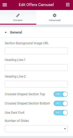
- General
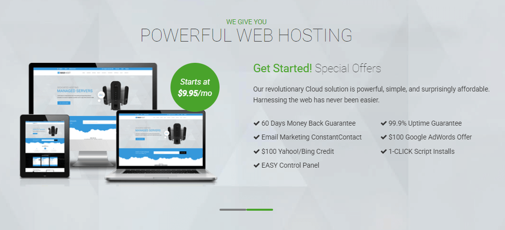
- Section Background Image URL- in this field, you need to input the Section Background Image URL.
- Heading Line-1- in this field, you need to type the Heading Line 1.
- Heading Line-2- in this field, you need to type the Heading Line 2.
- Crossed Shaped Section Top- Choose ‘Yes’ if you want to make your section’s top Crossed Shaped.
- Crossed Shaped Section Bottom- Choose ‘Yes’ if you want to make your section’s bottom Crossed Shaped.
- Use Dark Font- Choose ‘Yes’ if you want to use dark font.
- Number of Slides- Choose the number of slides from the Drop Down menu.
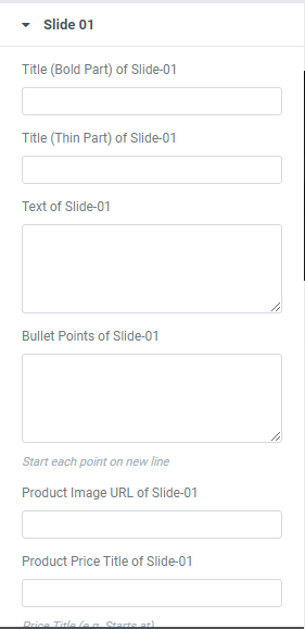
- Slide-01
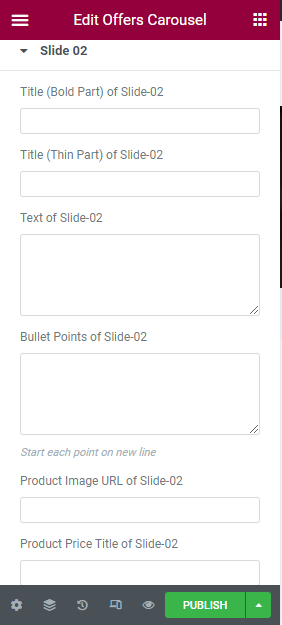
- Title (Bold Part) of Slide-01- Write down the title of Slide-01 in bold font.
- Title (Bold Part) of Slide-01- Write down the title of Slide-01 in normal font.
- Text of Slide-01- Write down the text of Slide-01 here.
- Bullet Points of Slide-01- Start each point on new line.
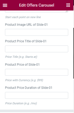
- Product Image URL of Slide-01- Insert the product image URL of Slide-01 here.
- Product Price Title of Slide-01- Write down the product Price Title of Slide-01 here.
- Product Price of Slide-01- Write down the product price with currency of Slide-01.
- Product Price Duration of Slide-01- Write down the product price duration of Slide-01 here.
- Slide-02, Slide-03, Slide-04 and Slide-05
Option fields for Slide-02, Slide-03, Slide-04 and Slide-05 are the same as the Slide-01’s option fields. If you want to use just 1 slide, fill the option fields of Slide-01 only. If you want to use 5 slides, fill the option fields of 5 slides.
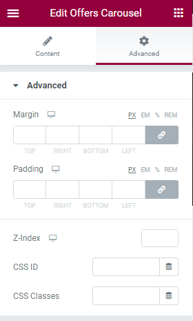
>> Advanced
- Margin – input the values for the margins in the required fields.
- Padding – here you can set the preferable custom padding. Fill in the values for the top, bottom, right, and left padding in pixels or % to apply your custom padding.
- Z-Index ( optional ) – input the values for the z-index if you need to use this option.
- CSS ID ( optional ) – add your custom CSS ID in this field.
- CSS Classes ( optional ) – add your custom CSS Classes here without the dot (.).
>> Background
- Switch between Normal or Hover modes.
- Background Type – in this block you can choose, whether you want to use a background color or a background image for the section.
>> Positioning
- Width – here you can choose between Full width, Inline and Custom.
- Position – here you can choose between Absolute and Fixed position.
>> Responsive
You can choose any option from Hide on Desktop, Hide on Tablet or Hide on Mobile.