Option Fields of this Widget in Elementor :
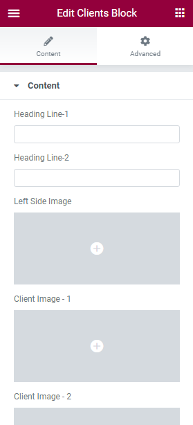
>> Content
- Heading Line 1 – type in the Heading Line 1 in this block.
- Heading Line 2 – type in the Heading Line 2 in this block.
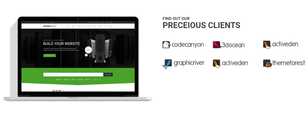
- Left Side Image – here you can select a suitable image to use in the widget.
- Client Image – 1 – here you can select a suitable image to use in the widget.
- Client Image 2, 3, 4 and the rests work same as Client Image 1.
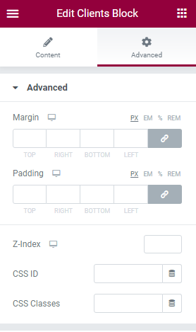
>> Advanced
- Margin – input the values for the margins in the required fields.
- Padding – here you can set the preferable custom padding. Fill in the values for the top, bottom, right, and left padding in pixels or % to apply your custom padding.
- Z-Index ( optional ) – input the values for the z-index if you need to use this option.
- CSS ID ( optional ) – add your custom CSS ID in this field.
- CSS Classes ( optional ) – add your custom CSS Classes here without the dot (.).
>> Background
- Switch between Normal or Hover modes.
- Background Type – in this block you can choose, whether you want to use a background color or a background image for the section.
>> Positioning
- Width – here you can choose between Full width, Inline and Custom.
- Position – here you can choose between Absolute and Fixed position.
>> Responsive
You can choose any option from Hide on Desktop, Hide on Tablet or Hide on Mobile.