Take a look at the front-end preview of Offers Carousel Widget from Maxhost Live Demo:
Using Offers Carousel Block in WPBakery
Go to Pages -> Add New on your WordPress Admin Dashboard and click on the ‘WPBakery Page Builder‘ button given at the top of the page. Now, click on the ‘Frontend Editor‘ button, and you will have a screen like below:

Click on the ‘Add Element‘ button and you will find a window as shown in the following image:
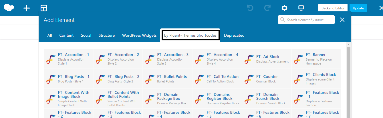
Under the ‘by Fluent-Themes Shortcodes’ tab, you will get all the custom WPBakery elements created for Maxhost theme.
Choose ‘Offers Carousel Block’ element from there. You will get the ‘Settings‘ window from where you can set your content of Offers Carousel Block as you need.
Settings
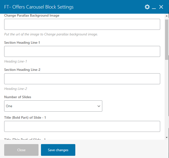
- Change Parallax Background Image– Put the URL of the image to Change parallax background image.
- Section Heading Line-1– Heading Line-1.
- Section Heading Line-2– Heading Line-2.
- Number of Slides– Choose the number of slides from Drop Down.
- Title (Bold Part) of Slide – 1– Title (Bold Part) of Slide – 1.
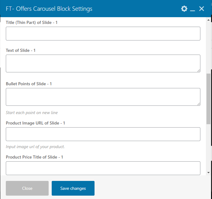
- Title (Thin Part) of Slide – 1– Title (Thin Part) of Slide – 1.
- Text of Slide – 1– Text of Slide – 1.
- Bullet Points of Slide – 1– Start each point on new line.
- Product Image URL of Slide – 1– Input image URLof your product.
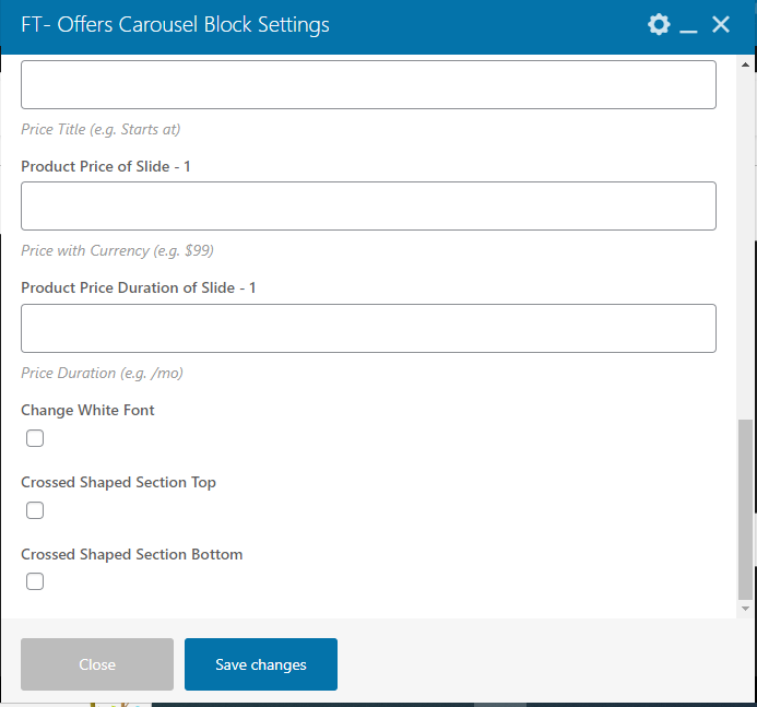
- Product Price Title of Slide – 1– Price Title (e.g. Starts at).
- Product Price of Slide – 1– Price with Currency (e.g. $99).
- Product Price Duration of Slide – 1– Price Duration (e.g. /mo).
- Change White Font– Check tick mark in the box below if you want to change white font.
- Crossed Shaped Section Top– Check tick mark in the box below if you want the section top crossed shaped.
- Crossed Shaped Section Bottom– Check tick mark in the box below if you want the section bottom crossed shaped.
Row Settings
General Tab
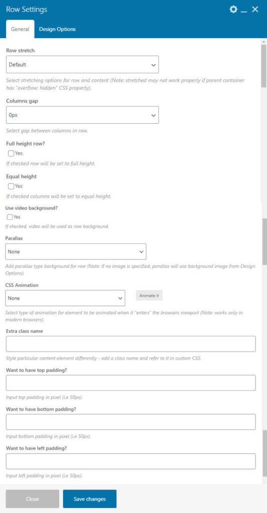
- Row Stretch – Select stretching options for row and content (Note: stretched may not work properly if parent container has “overflow: hidden” CSS property).
- Columns Gap – Select gap between columns in row.
- Full Height Row – If checked row will be set to full height.
- Equal Height – If checked columns will be set to equal height.
- Reverse Columns in RTL – If checked columns will be reversed in RTL.
- Content Position – Select content position within columns.
- Use Video Background? – If checked, video will be used as row background.
- Parallax – Add parallax type background for row (Note: If no image is specified, parallax will use background image from Design Options).
- CSS Animation – Select type of animation for element to be animated when it “enters” the browsers viewport (Note: works only in modern browsers).
- Row ID – Enter element ID (Note: make sure it is unique and valid according to w3c specification).
- Disable Row – If checked the row won’t be visible on the public side of your website. You can switch it back any time.
- Extra Class Name – Style particular content element differently – add a class name and refer to it in custom CSS.
- Want to have Top Padding? – Input top padding in pixel (i.e 50px).
- Want to have Bottom Padding? – Input bottom padding in pixel (i.e 50px).
- Want to have Left Padding? – Input left padding in pixel (i.e 50px).
- Want to have Right Padding? – Input right padding in pixel (i.e 50px).
Design Options Tab
- Border Color – You can select border color whatever you want.
- Border Style – You can select border color whatever you want.
- Background – Background Image can be uploaded from from your system or Media Library.
Column Settings
General Tab
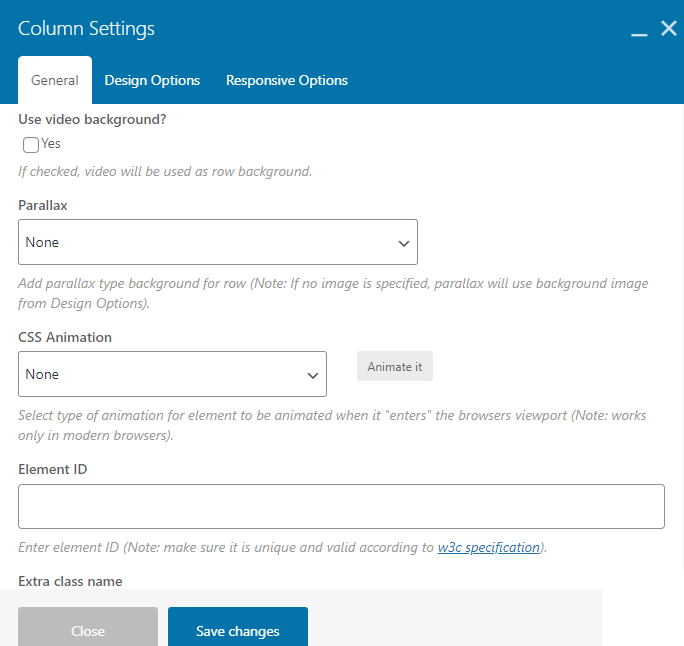
- Use Video Background – If checked, video will be used as row background.
- Parallax – Add parallax type background for row (Note: If no image is specified, parallax will use background image from Design Options).
- CSS Animation – Select type of animation for element to be animated when it “enters” the browsers viewport (Note: works only in modern browsers).
- Element ID – Enter element ID (Note: make sure it is unique and valid according to w3c specification).
- Extra Class Name – Style particular content element differently – add a class name and refer to it in custom CSS.
- Position – here you can choose between Absolute and Fixed position.
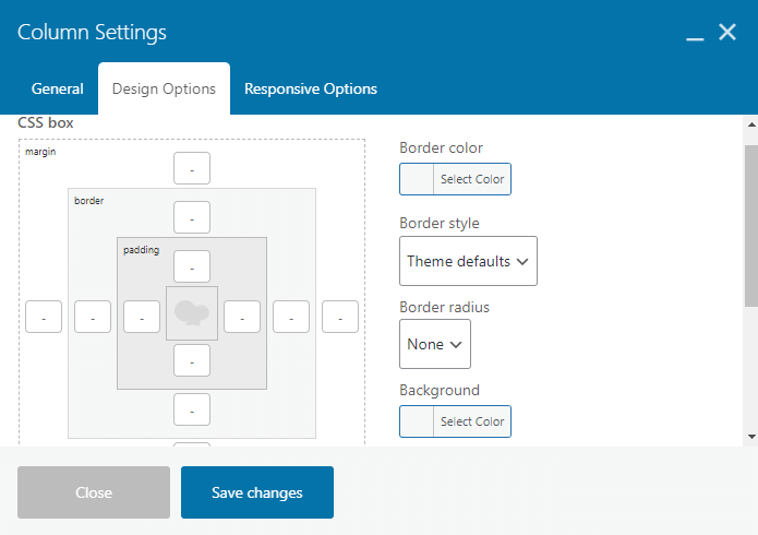
Design Options Tab
- Border Color – You can select border color whatever you want.
- Border Style – You can select border color whatever you want.
- Background – Background Image can be uploaded from from your system or Media Library.
Responsive Options
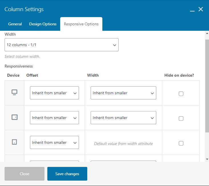
- Width – You can select column width from the Drop Down.
- Responsiveness – Adjust column for different screen sizes. Control width, offset and visibility settings.